
Creating a custom rounded button in Android Studio involves two main parts: defining the visual “shape” in an XML drawable file and then applying it to your button in the layout.
Here are the two best ways to do this: the Classic XML Drawable method (highly customizable) and the Material Button method (the quickest way).
The Classic XML Drawable (Most Versatile)
This method works for any View and gives you full control over gradients, borders, and specific corner radii.
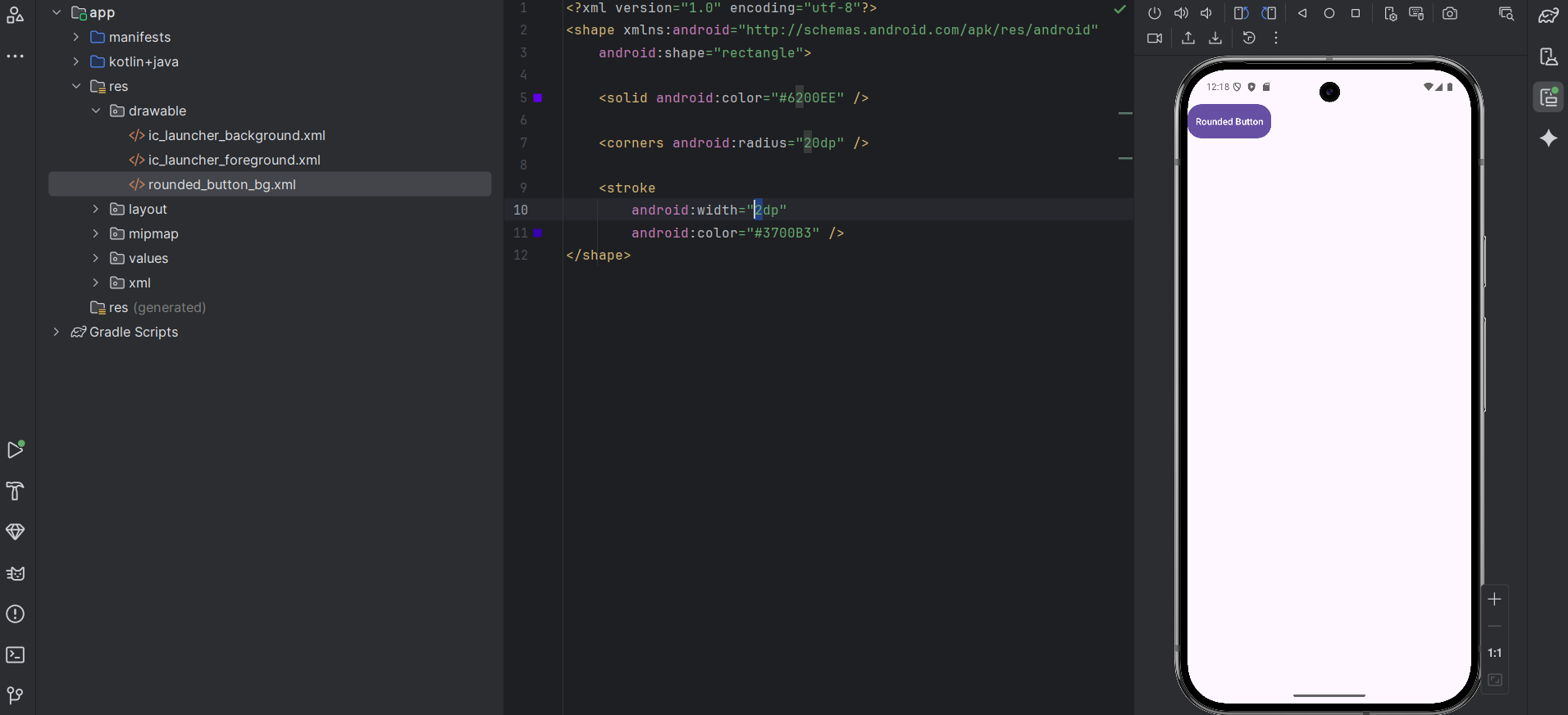
1. Create the Drawable File
Right-click your res/drawable folder → New → Drawable Resource File. Name it rounded_button_bg.xml.
XML
<?xml version="1.0" encoding="utf-8"?>
<shape xmlns:android="http://schemas.android.com/apk/res/android"
    android:shape="rectangle">

    <solid android:color="#6200EE" />

    <corners android:radius="24dp" />

    <stroke
        android:width="2dp"
        android:color="#3700B3" />
</shape>
2. Apply it to your Layout XML
In your activity_main.xml, set the drawable as the background.
Note: If you are using a Material Components theme, use
android.widget.Buttonorandroidx.appcompat.widget.AppCompatButtonto ensure the background drawable isn’t overridden by the theme.
XML
<Button
    android:id="@+id/myCustomButton"
    android:layout_width="wrap_content"
    android:layout_height="wrap_content"
    android:text="Rounded Button"
    android:textColor="#FFFFFF"
    android:background="@drawable/rounded_button_bg"
    android:padding="12dp" />